We begin, as we often do, with questions from the National Assessment of Educational Progress (``The Nation’s Report Card’’). In 2005, students were asked to study a pie chart (alternately called a circle graph):
We are heartened, nay, relieved, that 87% of American eighth graders got this benign comparison right, even though such a simple question seems more appropriate for elementary school.
In 2003, a question was asked on the Grade 8 exam that included some actual arithmetic:
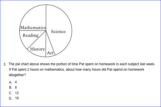
A bit more complicated, but results still showing a collective understanding, with 79% getting the right answer. (The identical question was also given in Grade 4, with 51% correct, which shouldn’t be cause for concern since building block concepts like percent are not usually taught until after Grade 4, although some students will recognize the fractions involved.)
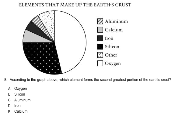
The 2003 NAEP also offered a Grade 8 question with a significant calculation:
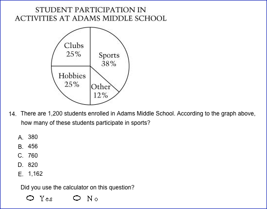
That pie charts involve any sample size, high or low, is a fundamental characteristic that students need to understand. In amassing the 54% who got the right answer, some made the correct calculation, with or without the calculator, or used an estimating technique, such as rounding before multiplying. Others may have arrived at the correct choice indirectly, without actually finding the correct answer, say by multiplying 38x1200 and seeing the digits 456 in the product. Some may have narrowed the choices by eliminating answers C, D and E as unreasonable, and some just guessed. Whatever the path to the correct answer, we still wonder: do enough students understand the concepts underlying a pie chart? It’s hard to accurately gauge from a multiple choice question.
This, of course, also raises the obvious question about the modern variant, closed-ended computer-based assessments, as an improved indicator of ``career or college readiness.’’ There have always been students who can push past a standardized exam, but we’d prefer to see complex tasks and the justification behind an answer (and we don’t mean in words), an ongoing theme in our blog.
In our quest for enlightenment, we looked for a problem which probed more deeply. We had to go back in time to the 1990 NAEP to find a Grade 8 question which came closer to our ideal:

The scoring guide specified that ``the brown region should be about (sic) 1/2 of the circle [and] the blond region should be about 1/2 the black region''. (The second ``about'' we understand, but the first?)
Thus a basic graphing skill was distilled into a one-step task that avoided sample size issues, and required no calculations (except to recognize 33 is about twice 17), protractors or rounding. Even without the added ``complications'', it is encouraging that 72% of eighth graders were able to construct a straightforward pie chart.
We are left to speculate on the results if students had to carry through the complete multi-step procedure, which would be more akin to the nature of a task leading to ``career or college readiness''.
Students ought to be able to begin with a data set, do the calculations, and create a pie chart using a compass, protractor and straightedge. It may not be problem solving, per se, but it is an important ability nonetheless because it pulls together multiple skills in a useful manner. This isn’t fancy math, it’s basic. As usual, we won’t directly enter the fray between the calculator and anti-calculator camps, but if students are going to encounter a situation in K-8 where a calculator is genuinely useful, this is it. Calculating percentages from sample sizes in the thousands is not easy to do with long division.
Central to understanding pie charts are proportions, and proportions are one of the fundamental concepts to learn in K-8. We at ccssimath.blogspot.com have said repeatedly that the learning of a concept and its procedures should be followed by applications so as to abstract the concept. Similar triangles and pie charts are two of the most important applications of proportions that are age-appropriate. (Equivalent fractions, too, but coming much earlier they’re rarely taught in terms of proportions.)
Oh, incidentally, where does CCSSI stand on pie charts? Um, we couldn’t find anything, except for some oblique references to ``mathematically proficient students'' in the Standards for Mathematical Practice. Let us repeat that: In twelve plus years of Common Core, not once are pie charts mentioned. Just like the pizza pies we mentioned at the beginning of this post, POOF, pie charts are suddenly gone from American math classrooms. So with these new standards, students will graduate high school without having studied or made a pie chart. It’s implicit, you say? Show us. With CCSSI's standards, clusters and domains, which educators are told to read literally and to which they must adhere closely, lest they be accused of straying from the path of Common Core righteousness, no one will dare teach pie charts. As a January 2013 report from UCLA's National Center for Research on Evaluation, Standards, and Student Testing states, ``If history is a guide, educators will align curriculum and teaching to what is tested, and what is not assessed largely will be ignored.''
Ironically, on the National Center for Education Statistics home page, near a link to the NAEP, there is another link to a website called College Navigator, in which high school students can research detailed information about colleges in the United States and its territories. Among the myriad data provided for each college, there are...pie charts!
We propose that, in the interests of making more rational choices in American math education, the following standard be added to Common Core:
X.XX.X. ``Students will learn to interpret and explain the information in pie charts. Either given, or after collecting, a data set, students will construct a pie chart using appropriate mathematical tools. Students will understand and be able to explain when a pie chart is an appropriate visual device for conveying information.’’
This isn’t outrageous stuff we’re advocating; fluency with graphing is a necessary component of mathematical literacy.
Thank you so much for the work that you are doing to clarify and attempt to correct the CCSS. As a math teacher, I love seeing the examples that you give to illustrate your point, and the way you try to 'fix' the errors in the standards.
ReplyDeleteCommon Core State Standards Initiative >>>>> Download Now
Delete>>>>> Download Full
Common Core State Standards Initiative >>>>> Download LINK
>>>>> Download Now
Common Core State Standards Initiative >>>>> Download Full
>>>>> Download LINK XP
I stumbled upon your site while trying to find the standard for circle graphs in the Common Core standards. I was unsuccessful, so I just googled it. I am amazed that this standard has just poofed from existence. This bothers me to some degree as a math teacher. I think students should learn all about all types of graphs, because that is one area that they will encounter after they leave the classroom. I actually saved a pile of Times Magazines with amazing graphs in them over the years to use in my classroom. Now to see that those magazines can't be used?!?! Wow...
ReplyDeleteIn general, I like the CC standards, but things like this are bothersome...but the main reason is bothers me isn't the CC creators fault, it's the fault of teachers, administrators, curriculum writers and developers and publishers, etc for not doing things that you KNOW are important and valuable just because there isn't an explicit indicator to teach it directly.
ReplyDeleteCircle graphs are mentioned in our Ohio Economics Standard 13: Information displayed in circle graphs can be used to show relative proportions of segments of data to an entire body of data. Students use circle graphs to interpret real-life data.
ReplyDeleteCircle graphs are also part of CCSS-ELA standards like CCSS.ELA-Literacy.RI.4.7 in which children interpret data presented visually, orally and quantitatively.
Don't throw away your circle graphs! Use them across the content areas!
nice
ReplyDeleteI first noticed that circle graphs were not in the Ohio math standards over 10 years ago. That's never stopped me from teaching my students to use them or from using circle graphs to support grade level content standards. In elementary: "Which pet did about 1/4 of the class prefer? We have 16 students. About how many students preferred a rabbit?" In middle school we used circle graphs to support proportional reasoning, calculating and interpreting percents, and relating angle measurements. We also reasoned about when circle graphs are or are not an appropriate representation for data. Every one of those activities did support the standards.
ReplyDeleteCommon Core State Standards Initiative >>>>> Download Now
ReplyDelete>>>>> Download Full
Common Core State Standards Initiative >>>>> Download LINK
>>>>> Download Now
Common Core State Standards Initiative >>>>> Download Full
>>>>> Download LINK